Wes Anderson // Centered
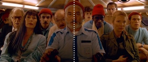
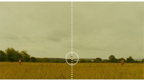
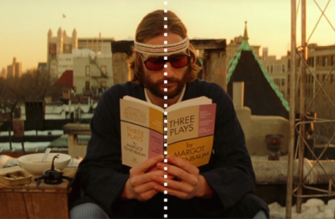
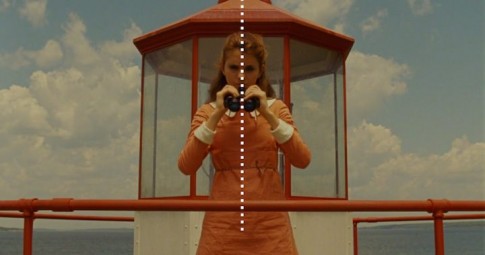
If you were ever in doubt as to how meticulous and pedantic the director of The Royal Tenenbaums is, then look no further than this video from Kogonada—who specializes in making videos about directors’ tropes and signatures—in which Anderson’s obsession with symmetry is laid clear.
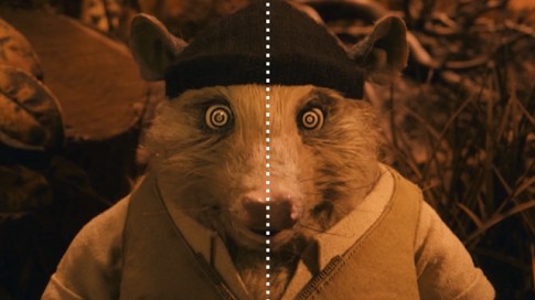
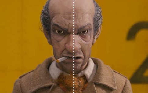
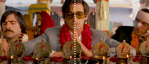
It’s not just that the shot has to be symmetrical, but he even goes so far as to make sure a character’s nose is lined up straight down the middle. The design choice is evident in both his live-action and animated movies, as you’ll see from the images below.



Comments